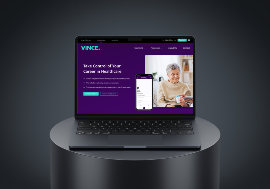
The website became easier to understand.
Clearer hierarchy and more direct messaging explain what Vince is, who it is for and how the platform supports healthcare staffing.

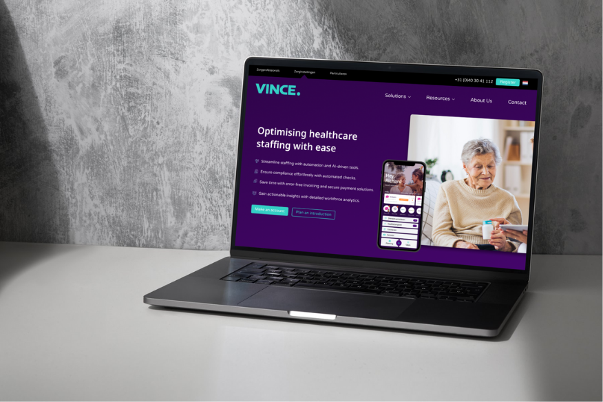
Vince People provides a digital platform for healthcare institutions and self-employed healthcare professionals, helping simplify recruitment, planning and administrative processes.
But the existing website made the platform difficult to understand. Navigation labels were unclear, pages contained large amounts of text, and the overall experience could make Vince feel more like a consultancy than a digital platform.
01 - CHALLENGE
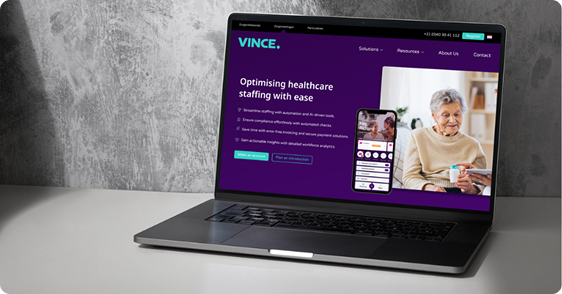
The existing website did not guide different users clearly. Navigation labels were vague, the purpose of the platform was difficult to understand and important information was buried inside long sections.
Trust was another challenge. Generic messaging, limited proof and strong calls to action asked users to commit before they had enough context to understand what Vince could do for them.
02 - APPROACH
“Help visitors quickly understand what Vince is, who it is for, and why it matters.”
Expert interview • Heuristic evaluation • Cognitive walkthrough • Competitor analysis • Trend analysis
03 - OUTCOME
Clearer hierarchy and more direct messaging explain what Vince is, who it is for and how the platform supports healthcare staffing.
The information architecture was reorganised around clearer journeys so institutions and professionals can reach relevant information with less searching.
Product visuals, testimonials, success stories and softer calls to action give users more evidence before asking them to make a commitment.
04 - THE SOLUTION
DESIGN SYSTEM
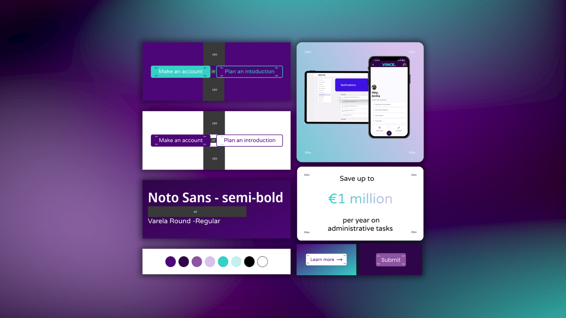
Typography, colour, spacing, buttons and reusable components were defined as a consistent system, helping the redesign feel coherent rather than like a collection of separate pages.
NAVIGATION
The new structure reduces vague labels and groups information around recognisable tasks, helping institutions and healthcare professionals understand where they should go next.
PRODUCT CLARITY
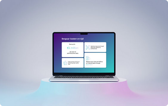
Product screens, feature cards and shorter explanations make the digital platform visible and connect benefits to concrete parts of the experience.
TRUST
Testimonials, real outcomes and success stories support the value proposition, while softer actions allow visitors to explore before they are asked to request a demo or register.
CONVERSION
Clearer calls to action guide visitors toward the right action depending on how much they already know about Vince.
05 - FINAL DESIGN
06 - REFLECTION
This project showed me how strongly interface design depends on positioning, information architecture and trust. Research helped separate visual symptoms from the underlying problem: people did not simply need a cleaner website, they needed a clearer explanation of the product, a more predictable path through the content and stronger evidence before committing.